 /* Code Comments */
conditional storybook knobs: how to keep stories clean
2019-12-04
|~4 min read
|621 words
I’m a big fan of Storybook JS. It makes sharing what’s possible with a React component trivial.1
There is a potential problem though: when components take a huge number of props, the Information Pane (specifically the Knobs tab) can become overwhelming.
I recently came across an elegant solution to the problem written by my colleague, Matteo Stohlman.
Before getting to the solution, let’s see why this can be a problem with an example.
Numerous Options: A Composite Component
There’s not limit to the number of props a component can receive and this problem is only magnified when a single component pulls together multiple smaller ones.
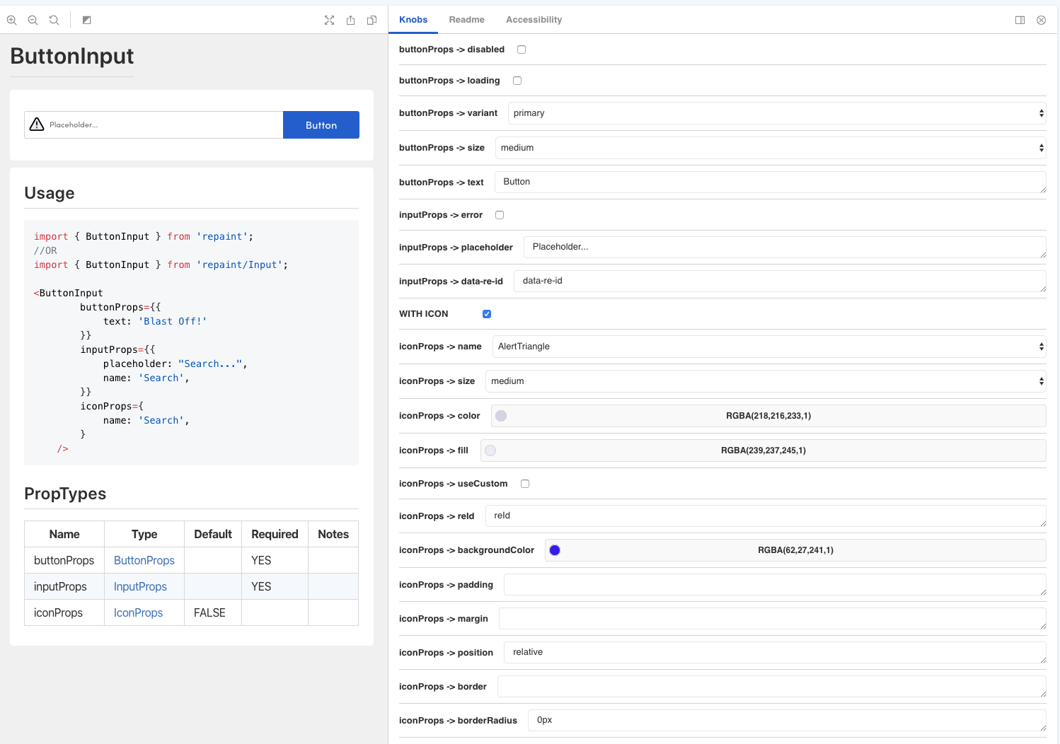
We call this patter a composite at Remine. One example of a composite component is our ButtonInput.
The ButtonInput does exactly what it sounds like (with a twist): it ties an <input> together with a <button>. The twist is the optional <Icon> component, a wrapper around the react-fontawesome component, that can be placed inside the <input>.
From a high level, the propTypes for ButtonInput are:
| Name | Default | Required | Notes |
|---|---|---|---|
| buttonProps | YES | ||
| inputProps | YES | ||
| iconProps | FALSE |
All of these props are objects and their definitions are determined by our <Button>, <Input>, and <Icon> components (the details of which don’t matter much at the moment).
The default ButtonInput looks like this:
But, if iconProps are passed through, the icon is rendered within the the <input> box and the placeholder text (and value) of the <input> are pushed to the right. For example:
Configuring Storybook To Conditionally Show Options
As a wrapper of react-fontawesome, <Icon> can take a number of props, but because it’s optional, it’s better to not clutter up the Knobs pane unnecessarily.
Looking at the Knobs pane, we see a WITH ICON option. This is not a real prop, but is used to hide all of the props related to iconProps if they’re not needed.
To set this up, we can use the boolean knob to conditionally show all of the options.
For example, here’s the story for ButtonInput
import { storiesOf } from '@storybook/react';
import { boolean, text, select, color } from '@storybook/addon-knobs';
...

storiesOf('Input/ButtonInput', module)
    .addParameters({
        readme: {
            content: Readme,
        },
    })
    .add('default', () => (
        <ButtonInput
            buttonProps={{
                disabled: boolean('buttonProps -> disabled', false),
                loading: boolean('buttonProps -> loading', false),
                variant: select('buttonProps -> variant', BUTTON_VARIANTS, 'primary'),
                size: select('buttonProps -> size', SIZE_OPTIONS_MAPPED, 'medium'),
                text: text('buttonProps -> text', 'Button!'),
                onClick: () => alert('so clicky!!'),
            }}
            inputProps={{
                onChange: props => console.log(props),
                error: boolean('inputProps -> error', false),
                placeholder: text('inputProps -> placeholder', 'Placeholder...'),
                name: 'Search',
                'data-re-id': text('inputProps -> data-re-id', 'data-re-id'),
            }}
            iconProps={
                boolean('WITH ICON', false) && {
                    name: select('iconProps -> name', ICON_OPTIONS, 'Circle'),
                    size: select('iconProps -> size', EXTRA_SIZE_OPTIONS_MAPPED, 'medium'),
                    color: color('iconProps -> color', undefined),
                    fill: color('iconProps -> fill', undefined),
                    useCustom: boolean('iconProps -> useCustom', false),
                    reId: text('iconProps -> reId', 'reId'),
                    backgroundColor: color('iconProps -> backgroundColor', undefined),
                    padding: text('iconProps -> padding', undefined),
                    margin: text('iconProps -> margin', undefined),
                    position: text('iconProps -> position', 'relative'),
                    border: text('iconProps -> border', ''),
                    borderRadius: text('iconProps -> borderRadius', '0px'),
                }
            }
        />
    ));
Conclusion
Using Storybook is a great way to communicate what is possible. That doesn’t mean you should just throw the kitchen sink at anyone who’s looking though.
Using a conditional flag like the WITH ICON in our example above can dramatically simplify the experience. Just be sure to make it clear that WITH ICON is not a prop itself!
Footnotes
1 Apparently Storybook has extended beyond just supporting React. Great news should I ever venture out since I love the tool for its ability to communicate what’s possible.
Hi there and thanks for reading! My name's Stephen. I live in Chicago with my wife, Kate, and dog, Finn. Want more? See about and get in touch!