 /* Code Comments */
css: box model sizing
2021-03-29
|~4 min read
|620 words
There’s quite a bit to unpack when it comes to the box-model, which is why it’s a topic that I feel like I constantly need to revisit if I step away for a moment. There are a number of corners and edge cases that make sense. Let’s talk about a few that I recently revisited as part of Josh W. Comeau’s CSS-for-JS course.
Box Sizing and content-box vs. border-box
This is one of those points that seems to confuse everyone and it’s baked into the defaults. This is an even bigger problem since the web is backwards compatible - so even if the majority of the community believes the default isn’t desired, we can’t change it since millions of websites are coded based on the assumption that it is the default. In fact, in a list that the CSS Working group published on mistakes made in the design of CSS, they say this nearly verbatim:
Box-sizing should be border-box by default.
What is the issue? Well, it has to do with how we count the width and what effect that has on layout (hint: it’s a lot).
The CSS property of box-sizing cares about how we measure the height and width of a box. It’s readily accessible in your dev tools and fundamentally, the box model consists of a few pieces:
- content
- padding
- border
- margin
The default way to count the width and height of a box is the content’s width and height. This means that if you set padding, the resulting box is likely larger than you expected and will push the other elements in the DOM in unexpected ways.
Let’s look at a trivial example:
<style>
  section {
    width: 100px;
  }
  .box {
    width: 100%;
    padding: 20px;
    border: 4px solid;
  }
</style>
<section>
  <div class="box"></div>
</section>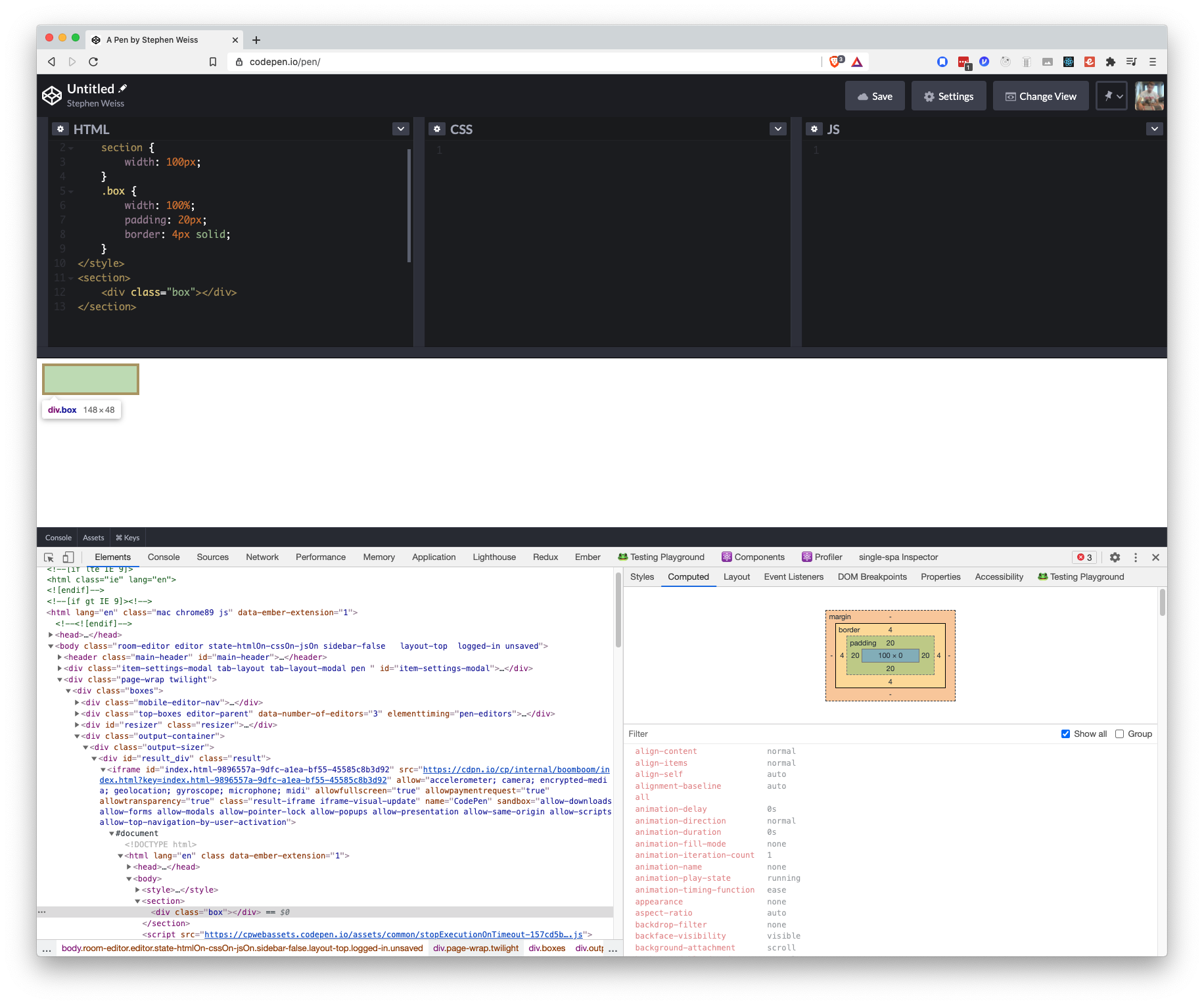
Even though we explicitly set the width at 100 pixels, it’s taking up 148 pixels of width and 48 pixels in height.
This is because it’s setting the content to 100 pixels wide, and then the padding is on top of that.
The border-box might make more sense in most cases.
Let’s make a small tweak to set box-sizing to take the border-box setting instead of the default content-box to our example to see how things change.
<style>
  html * {    box-sizing: border-box;  }  section {
    width: 100px;
  }
  .box {
    width: 100%;
    padding: 20px;
    border: 4px solid;
  }
</style>
<section>
  <div class="box"></div>
</section>
In this case, the width and height go all the way to the outside of the border. Since there’s 20 pixels of padding on both sides and 4 pixels of border as well, that leaves us with 52 pixels for the actual content. Not surprisingly, this is what the box-model diagram (bottom right of the above image) shows.
A Note On Margin
You’ll note that in both the content-model and the box-model, margin is not included in the calculation for an element’s size. It’s outside. This is important to remember when you’re trying to figure out how much space your element is going to take up on the page.
Conclusion
All in all, whether you use the content-box or the border-box is up to you. One comes preset, the other might make calculations easier to reason through. Either way, however, don’t forget that margin’s excluded, so the question is: do you want to include padding and border in your understanding of how wide/tall an element is? Or are you comfortable if they manage themselves.
Another way of thinking about this is: should width / height only refer to the content, or to the amount of space that content has to exist within?
Related Posts
Hi there and thanks for reading! My name's Stephen. I live in Chicago with my wife, Kate, and dog, Finn. Want more? See about and get in touch!