 /* Code Comments */
css modules: an introduction
2020-08-24
|~7 min read
|1339 words
I was looking through an app’s style sheets recently and came across a new word: composes:
.notificationNumber {
  composes: notificationItem;
  border: none;
  padding: 0;
  font-size: 0.8125rem;
}
Looking above in the same file, I found notificationItem:
.notificationItem {
  background-color: #fff;
  cursor: pointer;
  display: flex;
  flex-wrap: wrap;
  font-size: 1rem;
  padding: 15px;
  margin-bottom: 8px;
  border: 1px solid #bdbcbc;
}
So, what’s going on here? We’re composing .notificationNumber based on .notificationItem. .notificationNumber uses the .notificationItem as its base - then sets its own values (in this case, overwriting the original from .notificationItem).
Composition of styles is something I used rather extensively with styled-components, but CSS Modules make it available within pure CSS as well… sort of. “CSS Modules [are] not an official spec or an implementation in the browser but rather a process in a build step (with the help of Webpack or Browserify) that changes class names and selectors to be scoped (i.e. kinda like namespaced).”1 Therefore, before CSS Modules, we need a build step.
Using CSS Modules
All of the code that follows can be found in my CSS Module Sandbox repo on Github.
Let’s look at a bare bones example.2
Initialize a project:
mkdir css-modules-sandbox
cd css-modules-sandbox
yarn init
Now install dependencies:
yarn add webpack
yarn add --dev @babel/core @babel/preset-env babel-loader css-loader webpack-clie
Webpack with Babel are responsible for the build step. However, since we’re using css modules, we’ll also need the loaders, specifically: css-loader, and style-loader. The former interprets @import and url() like import/require() in order to resolve them. The latter injects CSS into the DOM.
At this point, package.json should look like this:
{
  "dependencies": {
    "webpack": "^4.44.1"
  },
  "devDependencies": {
    "@babel/core": "^7.11.1",
    "@babel/preset-env": "^7.11.0",
    "babel-loader": "^8.1.0",
    "css-loader": "^4.2.0",
    "style-loader": "^1.2.1",
    "webpack-cli": "^3.3.12"
  }
}

Now create a `.babelrc`:
```txt:title=.babelrc
{
  "presets": ["@babel/preset-env"]
}
And a webpack.config.js:
const path = require("path")
module.exports = {
  entry: "./src",
  output: {
    path: path.resolve(__dirname, "build"),
    filename: "bundle.js",
  },
  module: {
    rules: [
      {
        test: /\.js/,
        loader: "babel-loader",
        include: __dirname + "/src",
      },
      {
        use: ["style-loader", "css-loader"],
        test: /\.css/,
        include: __dirname + "/src",
      },
    ],
  },
}
This is a minimum setup and will produce inlined CSS when built.
For example:
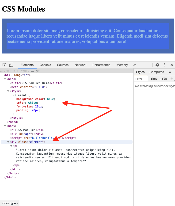
We can solve this using a webpack plugin, mini-css-extract-plugin which replaces the previous extract-text-webpack-plugin.
Looking at the diff for webpack.config.js we can see what’s changed:
diff --git a/webpack.config.js b/webpack.config.js
index 8afa268..efac894 100644
--- a/webpack.config.js
+++ b/webpack.config.js
@@ -1,10 +1,21 @@
 const path = require("path");
+  const MiniCssExtractPlugin = require("mini-css-extract-plugin");
+
module.exports = {
   entry: "./src",
   output: {
     path: path.resolve(__dirname, "build"),
     filename: "bundle.js",
   },
+    plugins: [
+      new MiniCssExtractPlugin({
+        // Options similar to the same options in webpackOptions.output
+        // all options are optional
+        filename: "[name].css",
+        chunkFilename: "[id].css",
+        ignoreOrder: false, // Enable to remove warnings about conflicting order
+      }),
+    ],
   module: {
     rules: [
       {
@@ -14,7 +25,7 @@ module.exports = {
       },
       {
         test: /\.css/,
-          use: ["style-loader", "css-loader"],
+          use: [MiniCssExtractPlugin.loader, "css-loader"],
         include: __dirname + "/src",
       },
     ],
The big point here, however, is that when we removed the style-loader, we are no longer injecting the CSS directly into the DOM… so we need to import it:
diff --git a/index.html b/index.html
index 877cfb9..8d0b59a 100644
--- a/index.html
+++ b/index.html
@@ -3,6 +3,7 @@
   <head>
     <title>CSS Modules Demo</title>
     <meta charset="UTF-8" />
+      <link rel="stylesheet" href="build/main.css" />
   </head>
We actually need to make one more change. Currently, the imports are absolute references, which means conflicts occur easily.
For example, imagine a second CSS file:
.element {
  background-color: red;
}
If the index.js imported both we could wind up with a conflict:
import greetings from "./robot"
import styles from "./app.css"
import alt from "./alt.css"

let element = `
<div class="element">
    <p>Lorem ipsum dolor sit amet, consectetur adipisicing elit. Consequatur laudantium recusandae itaque libero velit minus ex reiciendis veniam. Eligendi modi sint delectus beatae nemo provident ratione maiores, voluptatibus a tempore!</p>
</div>`

document.write(element)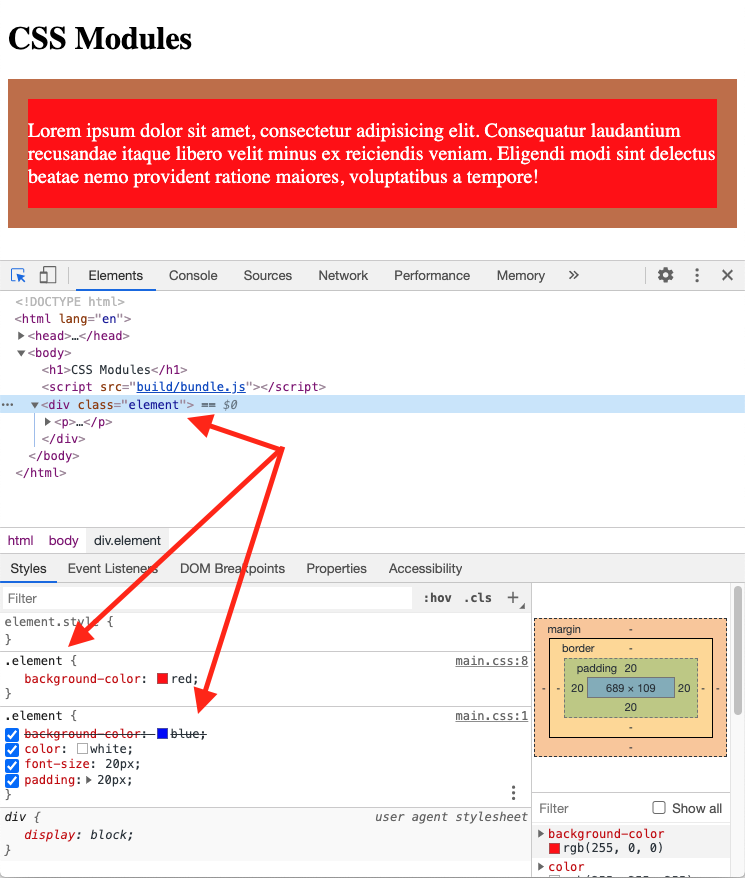
The fix here is to update the css-loader options to turn on CSS Modules3:
diff --git a/webpack.config.js b/webpack.config.js
index 87e31d3..c254359 100644
--- a/webpack.config.js
+++ b/webpack.config.js
@@ -29,7 +29,14 @@ module.exports = {
           {
             loader: MiniCssExtractPlugin.loader,
           },
-            "css-loader",
+            {
+              loader: "css-loader",
+              options: {
+                modules: {
+                  localIdentName: "[name]__[local]___[hash:base64:5]",
+                },
+              },
+            },
         ],
         include: __dirname + "/src",
       },
The localIdentName renames the classes into a unique, identifiable hash. More importantly, however, it turns on CSS Modules. This change to Webpack means we can avoid the conflicts we were seeing earlier if we specify the import:
diff --git a/src/index.js b/src/index.js
index bfd09dd..ac133fd 100644
--- a/src/index.js
+++ b/src/index.js
@@ -3,7 +3,7 @@ import styles from "./app.css";
 import alt from "./alt.css";

 let element = `
-  <div class="element">
+  <div class="${styles.element}">
     <p>Lorem ipsum dolor sit amet, consectetur adipisicing elit. Consequatur laudantium recusandae itaque libero velit minus ex reiciendis veniam. Eligendi modi sint delectus beatae nemo provident ratione maiores, voluptatibus a tempore!</p>
 </div>`;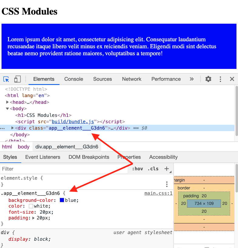
Composition Of Classes
Fantastic! We’ve now laid the foundation for composing classes. Composition allows us to pull in the characteristics of (multiple) other classes and then provides an opportunity for extension. The initial example of .notificationNumber demonstrated extending one class, but it would work for a more utility driven style (in the vein of a Tailwind CSS for example). BJ Cantlupe has a nice example of this in his post on tachyons from which the following is adapted.
Instead of one main class:
.element {
  max-width: 40rem;
  margin-left: auto;
  margin-right: auto;
}
We can use a compositional approach:
.mw40 {
  max-width: 40rem;
}
.center {
  margin-left: auto;
  margin-right: auto;
}
.element {
  composes: mw40 center;
}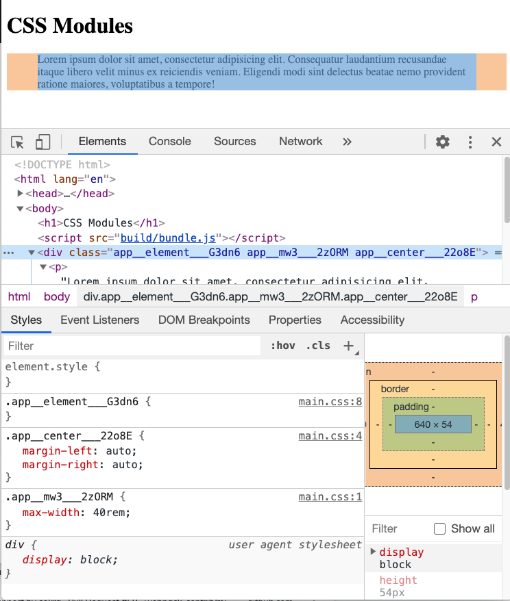
As this example demonstrates, composes can combine multiple classes. However, this can introduce some sneaky bugs. Imagine that the utilities were not as discrete as our original example. In that case the cascading part of CSS can affect the final outcome. For example:
.leftRed {
  margin-left: auto;
  color: red;
}
.rightBlue {
  margin-right: auto;
  color: blue;
}
.element {
  composes: leftRed rightBlue;
}
Composition order doesn’t matter. I.e., composes: leftRed rightBlue is equivalent to composes: rightBlue leftRed. What matters is the flow of the CSS itself. In this case .element is comprised of two separate modules which each set the color attribute. The result is that the most recent (since the specificity of the two are equivalent) takes precedence (i.e. the result is blue).
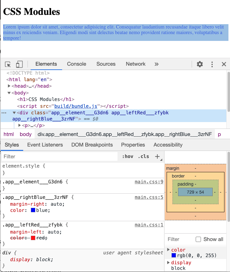
That said, specificity still rules:
.leftRed {
  margin-left: auto;
}
.leftRed > p {
  color: red;
}
.rightBlue {
  margin-right: auto;
  color: blue;
}
.element {
  composes: leftRed rightBlue;
}
In this case the text will take the more specific red since it’s inside a <p> tag.
Sharing Styles
So far I’ve been using a single file to define all of my CSS. What if we want to break them up but still get the benefits of reuse?
Well, we can through the use of imports.
For example:
.mw40 {
  max-width: 40rem;
}
.center {
  margin-left: auto;
  margin-right: auto;
}
Then in our app.css we can import these like so:
.element {
  composes: center mw40 from "./secondary.css";
}
Just like relative imports of Javascript files, however, this can become unwieldy quickly. Webpack aliases are a nice solution.
Conclusion
Whew! That was way more than I was anticipating to explore when I first saw the word composes, but the exploration really helped to cement a few principles that I’d taken for granted using styled-components (since it took care of them for me / worked just like Javascript).
Onward!
Footnotes
- 1 What are CSS Modules and why do we need them? | CSS-Tricks
- 2 Inspired and adapted from the same CSS Tricks series.
- 3 Credit to BJ Cantlupe for his blog post which helped me track down the necessary configuration for Webpack.
Related Posts
Hi there and thanks for reading! My name's Stephen. I live in Chicago with my wife, Kate, and dog, Finn. Want more? See about and get in touch!