 /* Code Comments */
css experiments: polygons and gradients
2021-03-10
|~5 min read
|810 words
I recently read Will Boyd’s “Diving into the ::before and ::after Pseudo-Elements”. It’s fantastic. Go read it now if you want to learn a thing or three about the topic!
While reading through it though, I was particularly drawn to the decorative ribbon banner example, likely because I draw these sorts of banners all the time in my paper journal.
I decided to recreate it myself - copying each line of Will’s CodePen into one of my own.
Why would I do that? Because along the way, watching how the image came together, I learned!
Specifically, I learned about the polygon function within the clip-path attribute.
The other piece that really stood out to me was the shading, all done by manipulating a background image.
Let’s walk through each piece one at a time.
Drawing Polygons
I’ll admit - this was the first time I’d ever really tried to draw with CSS. After a little head scratching, and realizing that like the rest of CSS, the origin is in the top left, it started to make sense!
Given a fixed size (in our case, a height of 100% and width of 80%), we can draw shapes!
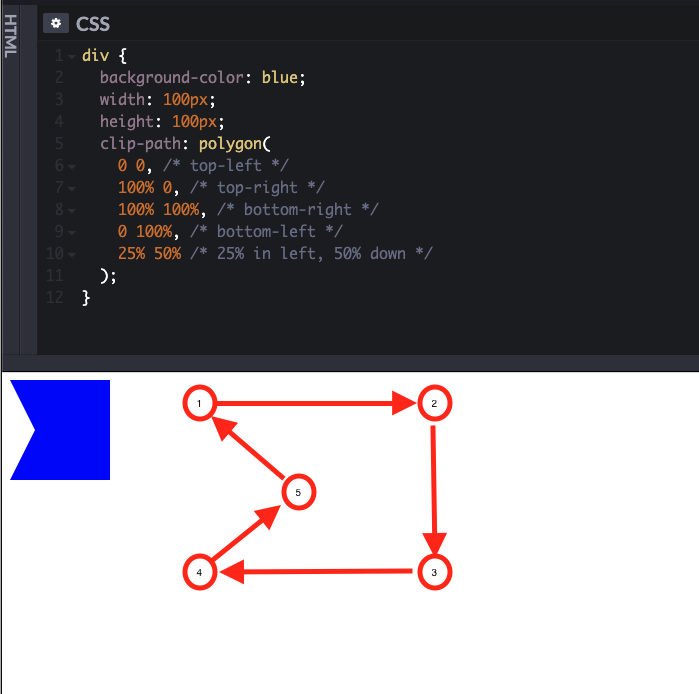
Here’s the polygon that we used in the ribbon isolated to its own Codepen:
One way to visualize this is by thinking of how each step connects. Imagine drawing the shape on grid paper - and using the top left corner as your reference point.
I also decided to try my hand at a star — it’s not the prettiest star, but you can see how it’s coming into view!
Background Images and Gradients
The final CSS to create the shaded piece of the ribbon to give the illusion of a folded ribbon this section:
h1::before,
h1::after {
  /* draw and position the folded ribbon bit */
  background-image: linear-gradient(45deg, transparent 50%, #5d3922 50%);
  background-size: 20px 20px;
  background-repeat: no-repeat;
  background-position: bottom right;
}
This short section packed a surprising number of nuggets.
Gradients
First up is the linear gradient and how we used that. Before we can take advantage of its power, however, we need to understand the API.
The first part of the API seems to be either:
<side-or-corner>or<angle>
The former is a value like to right which would suggest the gradient is horizontal and moves left to right. It’s equivalent to 90deg.
If you’d like more fine grain control, as we have here, you can use the angle to specify the direction of your gradient.
The second part is the color(s) you’d like to use to create a gradient. In our case, we used transparent and a darker shade of brown from the rest of the banner. You’ll note, however, that these colors also have a percentage that follows them. These represent how far along the gradient the color stops.
By default, colors transition smoothly from the color at one color stop to the color at the subsequent color stop, with the midpoint between the colors being the half way point between the color transition.
So, our transparent color, instead of blending all the way, stops at halfway. Similarly, our brown shade doesn’t bleed into the left half (at a 45 degree angle) creating a gradient, but starts at the halfway point.
MDN has a good example of this with the Gradient with multi-position color stops. This is exactly what were doing, except we only have two colors: transparent and brown (and it’s at an angle.)
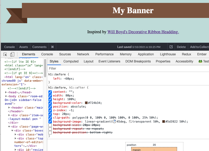
With just the background-image turned on, we can see that we’ve added a darker shade of brown that seems to cut across the ::before piece.
Sizing and Position
The remaining three lines are all specific to this particular implementation, but it’s interesting to see how they work.
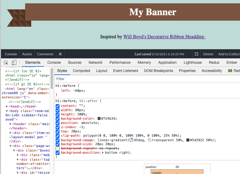
First up: fix the background image to a particular size. By default, background images repeat, so we get a much clearer view now of the 45 degree gradient we’ve created with it’s harsh cutoff:

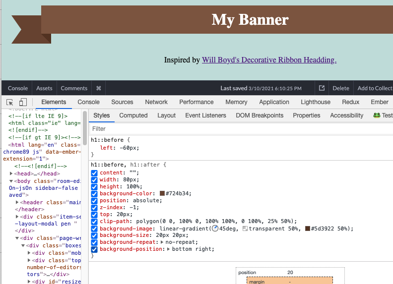
Next, see the really small gap between the banner and the ::before element? That’s because the background image repeats are just ever so slightly off.

We can account for that with background-position which allows us to set the origin from which out background image repeats.
And now, you might be able to see why we’ll need the no-repeat! We’ve perfectly slotted the background image into the corner to give the illusion of a fold… if it doesn’t repeat.
Conclusion
I read through Will’s article and learned a ton, but it wasn’t until I actually implemented it myself that I came to appreciate how each line interacted with the others.
It reminds me that just because we read something, it doesn’t mean we’ve learned it.
Related Posts
Hi there and thanks for reading! My name's Stephen. I live in Chicago with my wife, Kate, and dog, Finn. Want more? See about and get in touch!