 /* Code Comments */
dealing with disappearing position: 'fixed' on overflow?
2019-08-21
|~3 min read
|511 words
Have you ever tried to have an element overflow when one of its children is in a fixed positioned relative to it?
Fun fact: It doesn’t work. The fixed element is hidden. Not in an “off the screen” way. Not in an underneath another element way. It’s just hidden or “cut” as it was described on StackOverflow. 1
The only thing to do is to reorient the elements so that the element that was the relatively positioned parent is now a sibling — which mostly defeats the purpose.
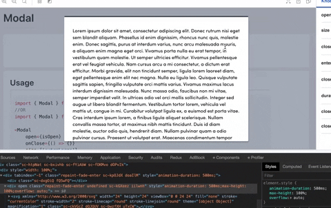
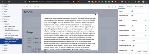
This was the problem I was facing with a Modal element I was working on. I wanted a Modal that’s body was too long for the screen to scroll internally but still have a Close Icon in the top right that a user could hit to close the window.
The original Modal Dialog (the part of the Modal that has content - as opposed to the “mask” which covers the original document) looked something like this:
<ModalStyled {...props}>
  {onClose && <CloseButton onClick={onClose}>X</CloseButton>}
  {children}
</ModalStyled>
The ModalStyled was just a styled div, but the key was that it has position: relative.
This meant that the button could be something like (using styled-components):
import styled from ‘styled-components’
export const CloseButton = styled.button`
  position: absolute;
  top: -18px;
  right: -24px;
`;
If you look at the .gif, however, you’ll notice that when the ModalStyled is made overflow:auto, the button disappears!
The best solution I could come up with was to wrap the whole thing in a div and use flex box to orient it so that my CloseButton would still appear above the Modal, if not slightly off to the top right corner as initially.
<Wrapper>
  <MiniWrapper>
    {onClose && <InternalScrollCloseButton name={closeIcon} onClick={onClose} />}
  </MiniWrapper>
  <ModalStyled {...props}>
    {children}
  </ModalStyled>
</Wrapper
Import styled from ‘styled-components’;

export const Wrapper = styled.div`
  display: flex;
  flex-direction: column;
  max-height: 100%;
  margin: auto;
  overflow: auto;
`;

Export const MiniWrapper = styled.div`
  display: flex;
  Justify-content: flex-end;
`;
Once I had this - I could flip between the two using a prop, internalScroll.
It basically turned into:
export const Dialog = props => {

const { internalScroll, …rest } = props;

return ( internalScroll
  ? (
    <Wrapper>
      <MiniWrapper>
        {onClose && <InternalScrollCloseButton name={closeIcon} onClick={onClose} />}
      </MiniWrapper>
      <ModalStyled {...props}>
        {children}
      </ModalStyled>
    </Wrapper)
  : (
    <ModalStyled {...props}>
      {onClose && <CloseButton onClick={onClose}>X</CloseButton>}
      {children}
    </ModalStyled>)
)};
Is it perfect? Hardly. Does it work and get me most of the way there without a significant amount of additional effort? Barring a generous internet soul divining the answer to me … absolutely.
P.S. I told a friend I’d made a Modal that had an internal scroll. His response? “Wince. Maybe that shouldn’t be a modal then?” Touché. None-the-less, this was my first blush with an interesting quirk of fixed position elements and overflow and I’ll never apologize for an opportunity to learn.
Footnotes
Hi there and thanks for reading! My name's Stephen. I live in Chicago with my wife, Kate, and dog, Finn. Want more? See about and get in touch!