 /* Code Comments */
masking inputs and more ref fun
2019-10-03
|~3 min read
|555 words
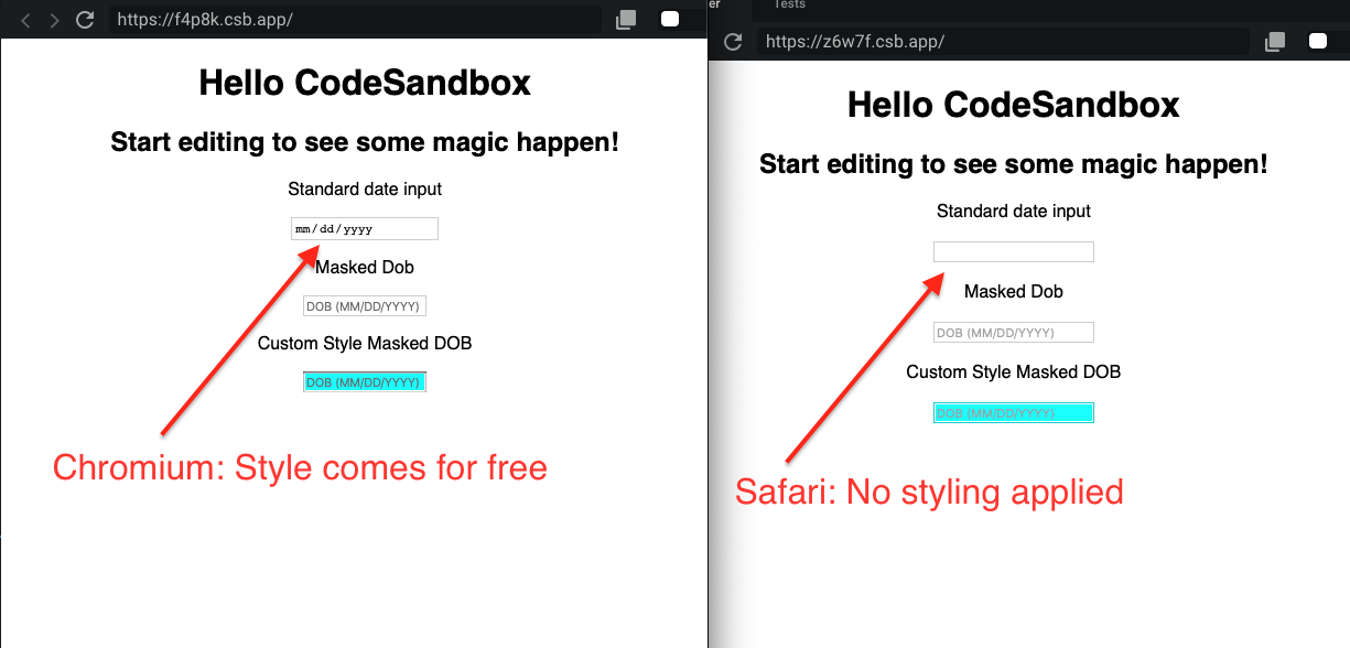
In learning about Auto-Complete In HTML Forms, I discovered that the type of an <input> makes can make a significant difference in how they are presented to users. The differences, however, are browser specific.
Take type="date" for example. Chromium browsers supply quite a bit of styling for free. Safari adds nothing.
The standard inputs in the screenshots below are simply:
const app = () => {
  return (
    {/* … */}
    <p>Standard date input</p>
    <input type="date" placeholder={"dob mm/dd/yyyy"} />
    {/* … */}
  )
}
To not be at the whim of a browser, I reverted back to a standard input and sought other approaches.
In this particular case, I really wanted to provide guidance to users on how to put the information in since formatting is important for the application to work properly.
To think about how this would work, I thought about passwords, but in reverse. Instead of taking a password and turning it into a string of ● (e.g., pa$$w0rd becomes ●●●●●●●●), I wanted a string that could be overwritten. In this case __/__/____.
CSS Tricks outlined several approaches depending on the stack - vanilla JS, jQuery, etc. and also noted some accessibility considerations to bear in mind (like that certain approaches will use the value of the input, not the placeholder to display the mask). 1
I ended up selecting the library react-text-mask because of it’s support for React and styled-components. The latter, however, turned out to be more fun than I was expecting when I started, largely thanks to refs.
The library provides a render method for custom <input> components which is noted helpfully in the docs. Interestingly for me, the way this method works is by providing its own ref which can be passed along to the styled component.
From the docs:
For example, to use with styled-components, which requires an innerRef:
<MaskedInput
  mask={[‘(‘, /[1-9]/, /\d/, /\d/, ‘)’, ‘ ‘, /\d/, /\d/, /\d/, ‘-‘, /\d/, /\d/, /\d/, /\d/]}
  placeholder="Enter a phone number"
  id="my-input-id"
  render={(ref, props) => (
    <MyStyledInput innerRef={ref} {…props} />
  )}
/>

const MyStyledInput = styled.input`
  background: papayawhip;
`;
Notice that the render method has an argument ref that’s passed along to the <MyStyledInput>? That’s provided by the component! There’s no need to create a ref in a containing component, no need for useRef or forwardRef! It’s actually quite simple.
Part of my confusion lay in the demonstration of using innerRef. As of v4, styled-components do not require an innerRef, however, despite having read the styled-component documentation, it still took a conversation with several others to understand that the innerRef was part of the styled-component api and not the react-text-mask. In retrospect should have been more obvious.
Update: As of v5,
innerRefhas been officially replaced withref.
After all of that, I arrived at a working solution: Masking the input, guiding my users, and providing a consistent user experience across browsers and devices.
If you’re interested, you can see my prototype in a Code Sandbox.
Footnotes
- 1 Input Masking | CSS-Tricks is a great start, and as noted, Estelle Wyel has a React compatible approach, though I ended up using a different library.
- 2 react-text-mask | npm
Hi there and thanks for reading! My name's Stephen. I live in Chicago with my wife, Kate, and dog, Finn. Want more? See about and get in touch!