 /* Code Comments */
trials in css: fit content to window
2019-08-03
|~3 min read
|478 words
One of my ongoing challenges with layouts on the web is the fact that a website does not naturally have an end. Unlike an 8.5”x11” sheet of paper, a website can go on forever.
That was the crux I faced when trying to get a layout to respond to the size of the window without referencing the window or viewport. Basically, I wanted to know if there was a way to style my components in a way that it would appropriately constrain its contents which wanted to grow.
What do I mean? This video shows how the table wants to grow, but if internalScroll is true it will collapse to only fill what’s available.
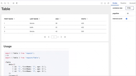
That’s a good start - but did you notice the containerSize prop that’s acting as the constraint? Since the screen size and resolution a user could be using can vary dramatically, I wanted a dynamic solution. That meant that while the internalScroll would be useful, it was only half of the equation. I also needed the container size.
To add to the fun, the page I was working on looked a little like this:

There was a lot more than just a container and a table. So, any solution I came up with had to take all of those pieces into account.
Flex to rescue. To make sure I understood how, I put together a mockup with JSFiddle.1
I pulled together a rough approximation of the layout of my app using basic HTML.
<div class="wrapper">
  <div class="flexbox-item header">Nav</div>
  <div class="wrapper">
    <div class="page-header flexbox-item">Page Header</div>
    <div class="table-container fill-area content flexbox-item-grow">
      <div class="table-body flexbox-item fill-area content">
        Content
        <br />
        <br />
        "Lorem ipsum …" // Put enough in here to make sure that it will exceed
        the height of the page.
      </div>
      <div class="table-footer flexbox-item">footer</div>
    </div>
  </div>
</div>
With that in place, it was time to work through the CSS. Fortunately, enough google searches got me a good starting point.2
In the end, my solution was quite simple:
/* Every wrapping container is 100% height */
.wrapper {
  height: 100%;
  display: flex;
  flex-direction: column;
}

/* This is the key to the whole thing */
.fill-area {
  overflow: auto;
  flex: 1;
}
When I see it written out like that, it feels like I should have been able to get to a solution much faster!
Regardless, I did get to a working solution and I’m pleased with how it turned out!
My thanks to Eric @ Visual Pulse3 whose JSFiddle was the inspiration I needed to get to my own solution and Sung Kim for his eyes and help in refining my early solutions.4>
Footnotes:
Hi there and thanks for reading! My name's Stephen. I live in Chicago with my wife, Kate, and dog, Finn. Want more? See about and get in touch!